Good flyers make me wanna hug whoever designed it and bake them fresh chocolate chip cookies. Bad flyers piss me off. You want some chocolate chip cookies?
DO THESE FOR COOKIES
Eye Catching- Everyone's got a built in noise filter. Without it, we'd go insane trying to pay attention to everything at once (Jonas Brothers). So it's mostly a good thing.
But you're fighting it too. Be different. Be vibrant. Be worth my attention.
If all the punk-rock bands have 8x10 color collage style posters, do a 4x6 black-and-white postcard with vectorized film noir style & swarm a wall with em. Get past the noise filter.
Readable- I'm looking at you black metal. Yes, it's brutal. Yes, it's the most ultra-violent goretastic evisceration scene on a poster ever (eye catching? yes), but if you can't read the relevant info 15+ feet away, no one will bother finding out about you. Your flyer will be put in the mental file as "cool artwork" not "hey I gotta see this show". You wanna make your show easy to attend.
-Posting on gray walls in downtown? Don't make a gray flyer!
-On cars? Think about the weather. If rain is coming, don't use paper flyers! (Guilty). Hot weather? Don't use laminate cards, they fuse to the windshield! People will associate scraping it off their windshield and being pissed off with your band. Not good.
-On school lockers? Great idea, but you might have a run in with the administration after one campaign. Save this method for an importnat gig, coat every locker in the school with a poster, then when "the man" comes down on you say, "My bad, I'll never do it again."
Then market the fact that your music was banned from school. Hell yes.
Know the market- There's more to "where" than just place. Think demographics & people.
We, a heavy metal band, played a battle of the bands at a rich, private, Methodist college. Not many metal heads, possibly hostile crowd and judges.
BAM
Get it?
Placement Creativity- Use a little thought when playing flyers (remember the noise filter?). Go as unconventional as you feel you can comfortably get away with. If there's a wall with a face painted on it, stick flyers on it in the shape of a happy face! (Did it)
Other places I've stuck em:
Lunchroom freezer / fridge
Inside paper towel dispensers
Magazines at a book store
Bathroom in the shape of a pentagram (Metal!)
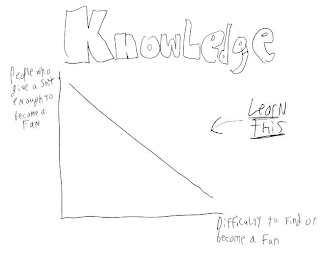
INFO- Yes, I do need to emphasize this. If your flyer doesn't have all the relevent info, it's useless. It must be easy to go to your show and easy to become a fan.
You need:
Bands
When
Where
Price
At least one website to hear music
How to get tickets
Other (Drink specials? 1/2 off if you dress in a toga? Groupies in free?)
Always remember:
The purpose of a flyer is to bring someone to your show.


No comments:
Post a Comment